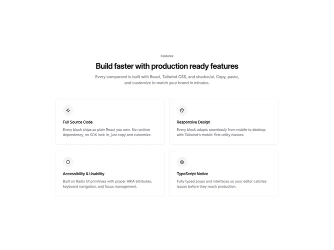
Feature 352 block design & features
Feature352 is a shadcn/ui feature section with a left-aligned intro containing a text label, heading, and description, followed by a two-column grid of large bordered cards. Each card has a circular icon badge with a muted accent fill, a title, and a longer description. The grid is constrained to a max width to prevent cards from stretching too wide at large viewports.
Cards use generous internal padding and a subtle border to create defined regions without heavy visual weight. The circular icon badges are slightly larger than in compact grids, matching the roomier card proportions. The two-column layout gives each feature more horizontal space for description text.
This is a standard Shadcn UI two-column feature layout suited for sections where fewer features need more detailed explanation. The left-aligned intro with a separate constrained grid creates a professional editorial feel common in B2B product pages.