Feature 17 block design & features
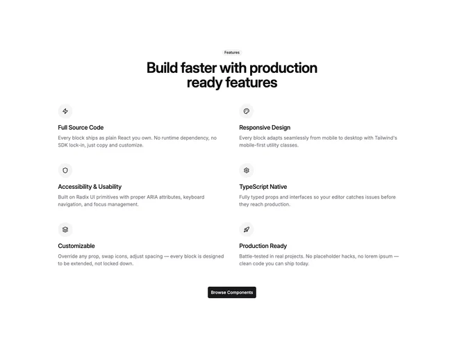
Feature17 is a flexible icon list built with shadcn/ui Badge and Button around the shared feature-icon-list props. When label or heading props are present, they render inside a centered column with tight tracking before a responsive grid maps up to six features, each row pairing a circular accent chip containing a Lucide icon with a title and muted description.
Layout density shifts from horizontal flex on small widths to a two-column grid with increased vertical gap on medium screens, keeping plenty of breathing room between entries. Optional primary button props center a large call-to-action under the grid when a URL is supplied.
Styling stays close to starter shadcn defaults: secondary badge, accent-filled icon wells, and text-pretty headings rather than heavy borders. The block is content-driven complexity because real pages need six coherent blurbs and matched icons, but structurally it is straightforward.
Mobile readers see a single-column stack of feature rows before the grid splits for wider viewports.