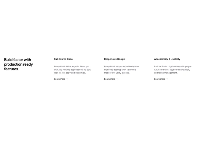
Feature 35 block design & features
Feature35 organizes Shadcn UI typography across a deliberate multi-column lattice. One oversized typographic cell spans multiple rows to announce the section theme while three sibling columns present parallel arguments. Each argument column carries an internal title, short paragraph, and link row ending with a directional arrow icon that signals forward motion without resorting to heavy button chrome.
Gutters stay even so scanning across the three arguments feels predictable. Link treatments stay text-forward with icon punctuation, which keeps the block feeling editorial rather than dashboard-like.
Typography scale makes the spanning title cell the strongest signal while the three sibling columns repeat the same internal rhythm. Uniqueness is moderate because the spanning headline reads differently from strictly equal-width four-column rows. You supply one overarching line plus three short arguments each with outbound text links. Content ask is moderate: one anchor statement plus three tight briefs and destinations.
As width tightens, the headline cell and columns stack so readers meet the spanning title before the trio of supporting columns in sequence.