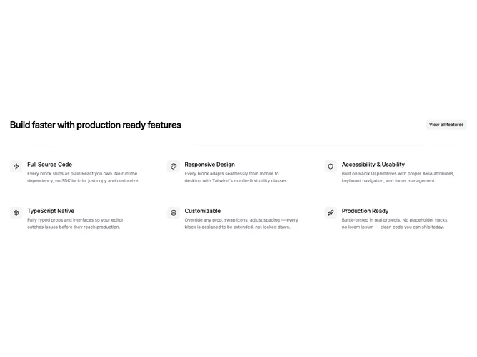
Feature 26 block design & features
Feature26 is a classic benefits grid built with shadcn/ui: a small badge and section heading lead into six cells, each with an icon, title, and supporting sentence. The grid can render up to three columns on wide layouts while staying a single column on phones.
Neutral cards or flat rows with consistent icon sizing and even gutters, sometimes separated by light rules between rows for scanability. No animation is required; rhythm comes from repeating the same text structure in each cell.
This is a standard marketing pattern executed clearly rather than inventing a new motif. Complexity is low, but you need six distinct claims that are honest and parallel in length so the grid does not feel lopsided. Good baseline for pricing-adjacent pages or capability summaries.
When the viewport shrinks, items stack in source order, preserving a predictable story arc from top left to bottom right.