Feature 194 block design & features
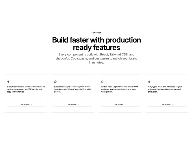
This section is built with shadcn/ui Card and Button. The header typographic stack is centered: eyebrow in monospace tracking, large semibold title, then a medium-weight muted subline to frame the grid.
Cards arrange in two columns on small screens and four on large ones with tight gaps so the set reads as a uniform ribbon. Inside each card, an icon sits above a single descriptive sentence in foreground color; the footer pins a full-width outline button linking to a URL with "Learn more" copy and a chevron that nudges on hover.
The visual language is clean and modular: bordered buttons, even card padding, and icon-first scanning. There is little ornament beyond spacing and type scale, so icons and microcopy carry personality.
Complexity is low to moderate: you cap at four visible features in code, so curate the strongest quartet and supply icon components, blurbs, and href values per card.