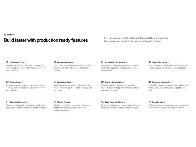
Feature 210 block design & features
This list section is built with shadcn/ui patterns. The top pairs a scroll-text icon with a small label on the left and stacks the main headline against a muted secondary paragraph on medium screens and up. Under that, a dense grid progresses from one column on phones to four on extra-wide desktops.
Each cell is a full-width anchor wrapping an icon, title, and short description. A chevron nudges right on hover and the row picks up a muted background on medium breakpoints and larger, which makes the list feel interactive without heavy chrome. Typography stays small and utilitarian in the grid so many items can coexist.
The look is clean, product-marketing neutral, and closer to a documentation or feature index than a narrative section. It is moderately complex in data only: you supply up to a dozen short entries with icons, titles, blurbs, and URLs. There are no hero images, so visual interest depends entirely on wording and icon choice.
Narrow layouts keep the same order while the header stacks vertically before the grid.