Feature 42 block design & features
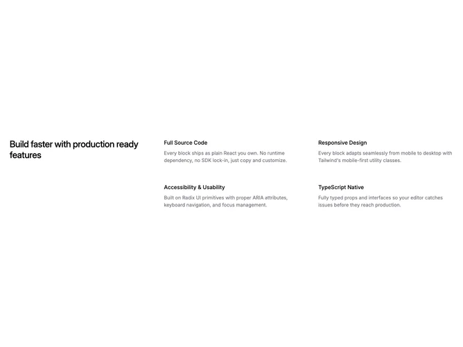
This section built with Shadcn UI places one long heading in the first column of a three-column grid while four supporting statements flow through the other cells. Each value is just a medium title line plus a muted paragraph, without icons or imagery. The asymmetry comes from the heading spanning two row heights so the prose block feels editorial rather than evenly tiled.
Typography stays calm: medium-weight section title, semibold-labeled value titles, and quiet gray supporting copy. Gutters between columns widen on large screens so the grid breathes. Corners stay sharp and the layout avoids cards or shadows, leaning on whitespace and the grid itself for structure. Nothing animates in the default template.
The look is restrained and company-handbook-like, closer to a culture or values page than a product tour. The row-span heading is the clearest twist on a common three-column feature strip. Complexity is moderate from layout logic only; you supply one heading string and four short value entries.
On narrow screens the grid collapses to a single column so the heading comes first and the four values follow in order.