Feature 360 block design & features
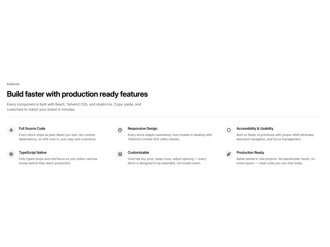
Feature360 is a shadcn/ui feature section with a left-aligned intro block containing an optional label, heading, and description, followed by a Separator component and a three-column grid of six feature items. Each item pairs a circular icon badge with a title and description in a horizontal layout.
The Separator creates a clear visual break between the editorial intro and the feature grid, giving the section a structured, editorial feel. Feature items have no card surface or border, relying on the icon badge and text grouping for visual cohesion. The grid uses generous vertical and horizontal gaps.
This brings the divided style to a left-aligned intro layout. The shadcn Separator component provides the dividing line rather than CSS border tricks, keeping it semantic. The horizontal icon-beside-text layout within each item is compact and scannable.