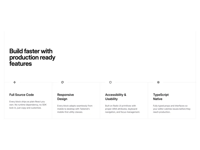
Feature 76 block design & features
Feature76 is an icon-driven feature band built with Shadcn UI: a prominent heading sits above a ruled grid that can show up to four items side by side on desktop. Each cell stacks a square icon holder that overlaps the top rule, a subheading, and a muted description. Hairline borders separate columns on medium and large widths while mobile stacks cells with horizontal dividers.
The look is editorial and systematic: plenty of whitespace, restrained typography, and grid lines that frame the section instead of cards or shadows. Icons sit on the default surface so they read as markers rather than colorful badges. The section feels tall and open, with padding emphasizing the horizontal split lines.
This block is moderately elaborate in structure but simple in assets: you need four concise value props and matching icons or small illustrations. It fits product marketing that wants a crisp comparison row without imagery.
Full four-column layout appears from the medium breakpoint; below that, items stack and keep readable line lengths. Decorative vertical lines at the section edges on desktop reinforce the grid without affecting interaction.