

Feature 43 block design & features
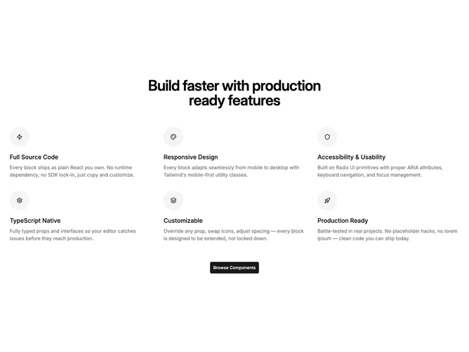
This block built with shadcn/ui centers a single large heading above six reasons arranged in a responsive grid of two then three columns. Each reason uses a filled circular tile for an icon, a semibold title, and a muted description paragraph, followed optionally by a wide primary button centered under the full grid. The structure is a classic "why us" grid capped by a conversion action.
Contrast comes from oversized headline weight against small icon wells on accent-colored circles. Body copy stays in muted foreground tones and line lengths stay comfortable on wide layouts. Density is balanced: enough space between rows that each reason scans separately. The design relies on stock interaction styles from the button and icon slots rather than custom animation.
The presentation is polished and familiar for SaaS marketing, with rounded icon treatment as the main decorative cue. It is more elaborate than a plain bullet list because of the centered hero title, six-up grid, and CTA, but still standard in pattern. You need six coherent reason titles, short blurbs, matching icons, and button label plus URL.
The grid stacks to one or two columns on smaller widths before widening to three, and the bottom button stays centered throughout.