Feature 65 block design & features
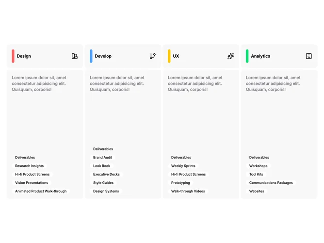
This block is built with Shadcn UI badges and presents four parallel tracks in a single row on large breakpoints. Each track has a top strip pairing a slim vertical color accent with a title and lucide-style icon; below that sits a muted panel that carries a paragraph and a column of rounded outline tags. Tap targets on compact widths toggle whether the lower panel shows, while on broad layouts the descriptive area stays visible for easier scanning.
From a glance, low-contrast tinted panels repeat across the columns with bold titles and restrained body copy. Icons read as categorical markers beside the rails. Badge chips read larger than typical tags so the list reads almost like milestones. Density is moderate with plenty of air inside each column.
Elaborate in structure but common in inspiration (capability pillars or phased offerings). Mood is orderly and catalogue-like rather than flashy. Replacing placeholders means four distinct titles, short descriptions, tag strings, palette choices for each rail, and appropriate icons.
Narrow widths stack full-width columns vertically; expanding one column hides others depending on interaction state encoded in this pattern, while wide layouts emphasize side-by-side comparison.