Feature 8 block design & features
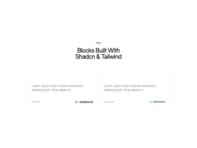
Feature8 is a simple two-up showcase built with shadcn/ui badge, card, and outline button patterns. The top band centers an outline badge and a large balanced headline. Below, two cards sit side by side on desktop with light typography inside, a Learn more outline treatment, and a footer row pairing a short caption with a brand mark. The first card highlights the shadcn/ui wordmark and the second highlights Tailwind, reflecting how the default demo sells the stack.
Interaction differs by breakpoint: on wide layouts the Learn more chip is tucked to the top-right and fades into view when the card is hovered, while phones expose a compact chevron button next to the body copy. Cards stay flat with modest padding and rely on borders instead of elevation.
This is intentionally close to starter-docs styling: confident type, minimal chrome, and logos doing most of the storytelling. Uniqueness is light; it is a dependable pattern for framework or developer-tool landing pages.
The layout stacks the cards vertically on small screens while keeping the centered header full width. Wordmark assets sit in a predictable footer slot inside each card for quick scanning.