Feature 234 block design & features
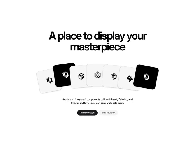
Feature234 centers everything in a vertical stack built with shadcn/ui buttons and plain layout wrappers. An extra-large display headline sits above a row of overlapping square cards with rotated frames and thumbnail images. Under the row, a short supporting sentence and two rounded full-width buttons sit in a horizontal pair. Framer Motion drives per-card hover lift and z-order so the fan of cards feels tactile on pointer devices.
Light background with high-contrast black body text in the support line while the headline uses tight tracking and very large sizes. Cards mix light fills and subtle borders with negative horizontal overlap to create a deck effect. Motion is the main ornament: cards ease upward on hover and the visible count changes by breakpoint so the row does not overflow on narrow viewports.
Playful, gallery-forward, and closer to a creative portfolio promo than a dense product spec. Complexity is moderate to high because of the motion layer, many placeholder images, and breakpoint-specific visibility rules for edge cards. You need a set of square crops and copy that justifies the dramatic headline and CTA pair.
The card row clips less aggressively on large screens where more tiles show; on small screens outer cards hide so the stack stays legible without horizontal scroll.