
Feature 217 block design & features
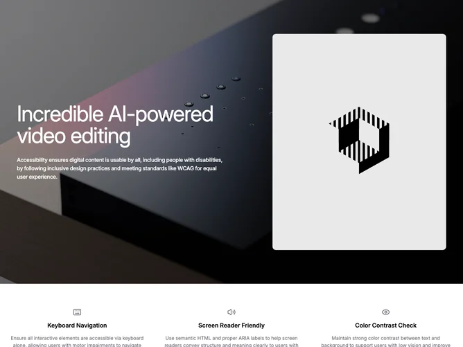
Feature217 stitches two beats with Shadcn UI typography and framing: first a cinematic band with photographic background covered by a dark wash, oversized white headline and paragraph, plus a rounded-corner illustrative image tucked into predictable proportions; second a roomy white section aligning three symmetric columns headed by muted stroke icons, bold titles, and neutral supporting copy about inclusive practices.
Contrast flips sharply between hero darkness and airy body space. Iconography stays minimal outline weight to avoid competing with the dense hero photography, while typography in the hero reads loud and condensed.
Messaging points at inclusivity scaffolding yet the visuals still feel glossy enough for flagship marketing pages. Complexity is modest structurally though you need plausible hero storytelling plus three succinct policy statements that do not repeat.
On large breakpoints the headline and framed image span two aligned columns inside the tinted panel; shrinking stacks them while keeping text legibility over the tempered photo.