
Feature 218 block design & features
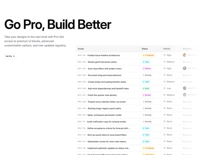
Feature218 frames a pricing or upgrade story by stretching a large display headline across the full content width, then resolving into a two-column conversation built with shadcn/ui typographic rhythm and a single outline call-to-action carrying an arrow icon. The narrower column carries multi-line supportive copy in muted tone while the wider column dedicates space to a square-cropped photograph with rounded outer corners so the subject reads as a poster panel.
A subtle wash sits along the photo edge so the frame visually tucks into the surrounding background instead of ending with a hard crop. Text hierarchy leans on weight and size jumps more than color accents, keeping the section readable on default light surfaces.
The layout feels contemporary editorial: plenty of negative space, restrained chrome, and one deliberate motion cue through the CTA. Content load is moderate because the hero line and long paragraph need confident messaging to earn the space.
The grid compresses so copy leads on small screens while the image remains below or following the text block depending on source order, preserving the fade treatment on the wide asset when space returns.