Feature 21 block design & features
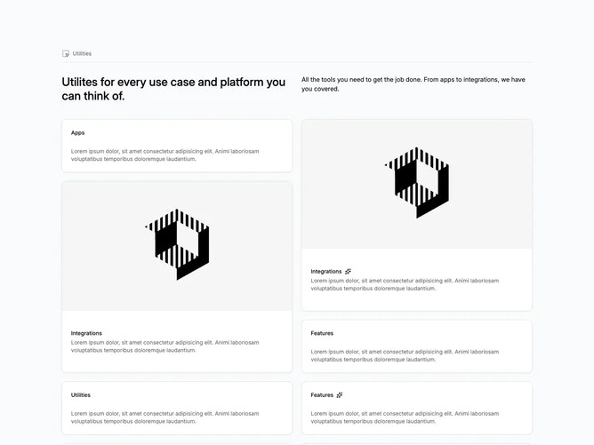
This utilities overview uses shadcn/ui cards in two parallel stacks beneath a compact intro. A small label sits beside a Lucide icon, then a horizontal rule, then a two-column header row pairs a medium-weight title with a body paragraph. Each stack mixes text-only cards, cards with a wide raster on top, sparkle icons beside labels, and an outline badge that marks an item as coming soon.
Light gray page background sets the cards forward, and card padding stays even so the masonry-like mix still feels orderly. Borders are subtle aside from one dashed, shadowless card that reads as a placeholder slot. Imagery uses a shared widescreen crop pattern when it appears.
The block sits in a utilitarian, documentation-adjacent style rather than a glossy marketing look, partly because several cards still carry lorem text in the demo. Uniqueness comes from the uneven card rhythms in two parallel columns, which is a bit busier than a uniform grid. Content work is the main effort: you need several coherent categories, optional media, and real copy to replace placeholders.
On smaller screens the card columns collapse to a single vertical feed in source order while the top summary spans full width.