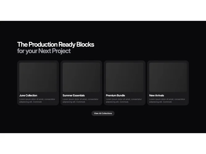
Feature 287 block design & features
Feature287 lines up as many as four narrative cards in a responsive grid, built with Shadcn UI buttons anchoring the footer call to action. Every card wraps title and supporting text inside the same glowing star treatment so each tile feels like a small spotlighted panel rather than a flat bordered box.
Against deep backgrounds the star fields supply most of the ornament while copy stays high contrast and readable. Spacing breathes between cards on wide layouts and tightens once columns collapse. The secondary button under the grid gives a single explicit next step without competing with individual cards.
The aesthetic skews modern marketing with a hint of night-sky theatrics. It is more embellished than a basic icon-and-blurb grid because of the repeated luminous backdrop. Content-wise you want four distinct headlines plus short explanations that stand alone inside equal-height cards.
When horizontal space drops, the grid reduces column count so cards stack in one or two columns without clipping the star layers.