Feature 147 block design & features
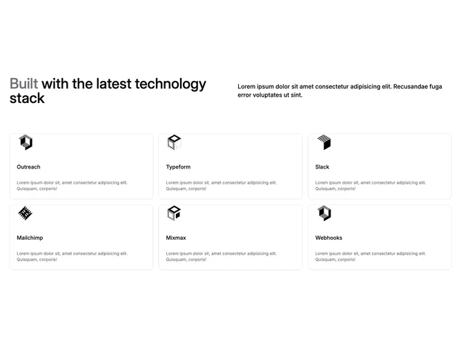
Feature147 catalogs partner logos inside shadcn/ui cards after a split editorial header: stacked mega-line introduces muted lead word then remainder sentence on large screens beside explanatory paragraph in subdued tone. Body grid lists six integration entries with small brand artwork, bold card titles, and supporting copy lines inside uniform padding shells that tile one, two, or three across depending on width.
Visual language centers white or near-white cards on default background, tight corner radius, modest drop shadow implied only through border contrast, typography scales from display-sized opener down to small body for descriptions, iconography limited to supplied raster logos at fixed width. Static presentation without motion keeps scanning predictable.
Feels like a sober integration marketplace slice: informative, slightly corporate, not ornamental. Complexity is moderate on content because six coherent partner stories need assets and tight blurbs even though structure is repetitive. Current source hardcodes an integrations array, so updates mean editing data within the block file.
Grid tightens to single column handheld preserving legible card height and consistent vertical spacing between entries.