Feature 161 block design & features
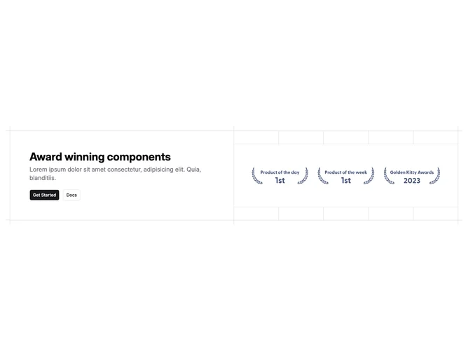
Feature161 is a split marketing module built with shadcn/ui buttons, emphasizing engineering drawing cues through bordered gridlines and small orthogonal markers at corners. Left column concentrates on a bold declarative headline, muted subheading, primary action, and secondary outline companion. Right column showcases partner marks inside a bordered ribbon flanked vertical rules that echo technical blueprints.
Cool neutral palette and restrained contrast keep typography dominant while ornamental lines frame whitespace intentionally. Spacious padding prevents the ornamental grid from feeling cramped.
Interpreted aesthetically, this is precise and slightly brutalist-modern, distinguishing itself via line work instead of gradients. Complexity is modest structurally but distinctive because of ornamental chrome.
Responsive states stack cells so copy precedes logos; confirm button pair still wraps cleanly when horizontal space tightens without breaking the bordered shell alignment.