Feature 294 block design & features
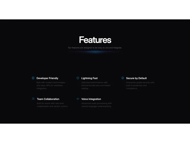
Feature294 arrays five icon-led selling points in a responsive grid built atop shadcn/ui spacing primitives while the Sparkles layer adds continuous shimmer behind the cards. Each cell carries an emblem, short title, and paragraph so scanning stays modular even without bullets.
Foreground panels stay comparatively quiet with rounded rectangles or soft elevation so icons pop against the animated field. Hierarchy favors consistent icon size and balanced text blocks rather than one oversized hero tile.
The combination of sparkle animation plus an odd-numbered five-pack reads distinctive compared with a plain icon grid, though the interaction remains informational. Complexity is moderate and mostly content-driven because five coherent claims need parallel weight.
When columns collapse, rows reorder into a single stream that keeps icons aligned with headings for readable thumb scrolling.