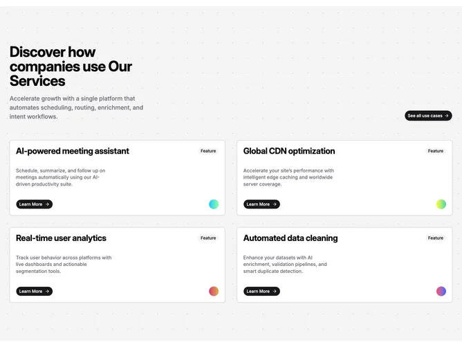
Feature 221 block design & features
Feature221 is an editorial style feature grid built with shadcn/ui cards and badges. The top bands headline and subtitle on one side with a standalone rounded full-width-style CTA on the other inside a muted field with a dotted texture. Beneath it, four feature entries render in two columns at medium width and wider. Each card carries a prominent title row, a small neutral badge labeled for the feature role, descriptive copy, and a rounded pill button wired as a Learn More link next to a solid circular accent filled with a horizontal gradient.
Surfaces alternate between patterned muted canvas and lifted card backgrounds with hairline borders and generous internal padding. Typography leans headline-forward on card titles with supporting text in muted body weight. The gradient orbs at the foot of each card give each tile a distinct color note without full-bleed illustration.
The look is modern SaaS marketing with a controlled color system on every row. The pattern plus gradient dots keep it from reading as a plain white grid. Content load is moderate: a section title, intro blurb, CTA label, and four feature rows with titles, descriptions, links, and chosen gradient pairs.
On narrow screens the header stacks vertically, the CTA moves below the text, and the grid becomes a single column while preserving card spacing.