Feature 137 block design & features
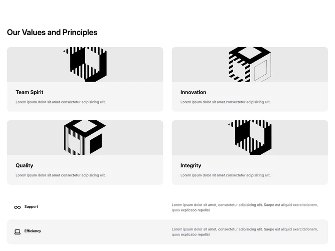
Feature137 is a values-focused block implemented with Shadcn UI conventions and medium-weight line icons. After a strong section title, the first band is a responsive two-column grid of cards: each card shows a cropped banner image, a large semibold value name, and placeholder body copy on a muted rounded panel. Beneath that, a vertical list of rows alternates surface treatment so every other row gains a muted fill, while each row aligns a medium icon and bold label on one side with a wider paragraph on the other.
Look and feel is crisp and editorial: generous rounded corners on the image tiles, restrained borders, and rhythmic alternation in the lower list to separate principles without hard dividers. Icon scale is confident but not playful, keeping the tone closer to corporate storytelling than consumer whimsy.
Uniqueness comes from pairing two presentation modes in one section, image-heavy tiles then text-only striped rows. Complexity is moderate because you need eight coherent items (four visual, four textual) for the story to stay balanced.
On small screens the value cards stack first; icon rows compress to a vertical alignment with icons and headings above the supporting copy.