Feature 270 block design & features
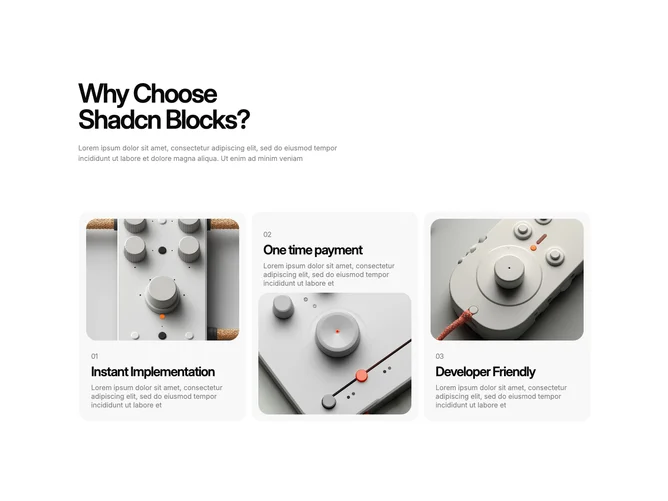
Feature270 is a feature stack built without exported shadcn/ui primitives in the marquee sense; instead it wraps each item in a custom perspective pin container with Motion-powered flourishes. The top introduces a large left-aligned title and a faded introductory line. Below, three panels link out, each showing a rounded photo, numbered kicker, bold title, and muted description. The image and text blocks swap vertical order from item to item so the rhythm alternates down the page.
Panels sit on soft muted shells with rounded outer corners and hover lift on imagery via shadow. Hovering a panel tilts the whole card in 3D space and reveals animated cyan beams, glowing rings, and a small rounded tag that carries a call-to-action label. Typography stays tight and product-like with semibold titles and lighter supporting lines.
The aesthetic is experimental and motion-heavy, closer to an Aceternity showcase than a minimal corporate band. Complexity is high due to the per-card 3D transforms, looping hover effects, and sizable vertical footprint driven by fixed grid heights across breakpoints. Plan for three coordinated photos, parallel titles, and consistent-length blurbs so the alternating layout stays balanced.
Responsive rules collapse the outer grid from three columns to two and then one while keeping the pin perspective behavior; expect significant vertical scroll on phones because each panel retains height for the effect.