

Feature 97 block design & features
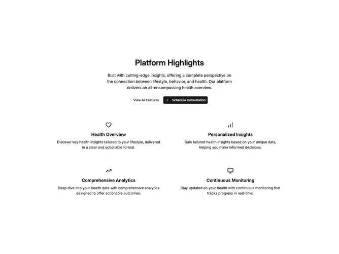
Feature97 is a centered feature section built with shadcn/ui. A narrow max-width column holds a semibold heading, a body paragraph, and a pair of buttons arranged side by side. Below, a two-column grid constrained to a wider max-width displays four feature items, each centered with a small Lucide icon, a semibold title, and a paragraph of descriptive text.
Buttons pair an outline variant with a solid primary variant that includes a plus icon. The icon features use a consistent small size across all four items. Titles use a medium semibold weight and body copy remains in default foreground without muted treatment, giving the feature descriptions slightly more emphasis than typical muted paragraphs. The grid uses generous gap spacing to keep items well separated.
The aesthetic is simple and centered, resembling a platform overview or highlights panel with no cards, borders, or background differentiation between items. Everything relies on whitespace and typography hierarchy alone. Complexity is low since you supply four static feature items with icons plus the header text and button targets.
On smaller screens the two-column grid collapses to a single column and the button pair stacks vertically.