Feature 237 block design & features
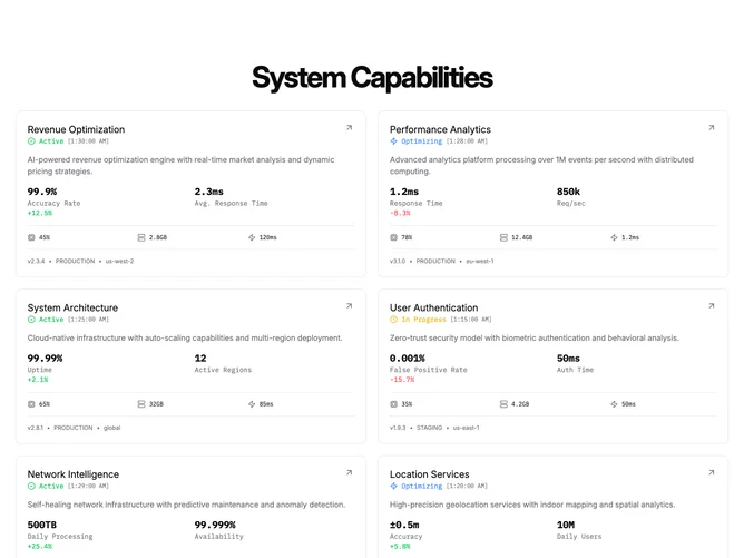
Feature237 lays out six rich data cards in a responsive grid with plain shadcn-style tokens for borders and cards. A centered bold title introduces the grid. Each card is an entire anchor wrapping a bordered column: title row with outbound arrow affordance, color-coded status line with monospace timestamp styling, explanatory paragraph, a two-column metrics band with numeric trend tinting, icon rows for synthetic CPU memory and latency, and a monospace deployment trio for version environment and region.
Mostly flat cards with monospace numerics and restrained icon sizing. Hover lifts border color toward primary and adds shadow, while the outbound arrow translates slightly. Typography mixes standard sans for narratives with monospace for telemetry, reinforcing an observability dashboard tone. Palette leans neutral with semantic green yellow and blue cues on status dots.
Operational and futuristic: reads like a condensed systems catalog rather than glossy marketing bullets. Complexity is high and content-driven because each card ships long descriptions and multiple numeric fields derived from structured data arrays. Replacing placeholders means supplying credible metrics alongside narrative copy.
Stacks to one column first, then splits into two equal columns once there is horizontal room.