Feature 80 block design & features
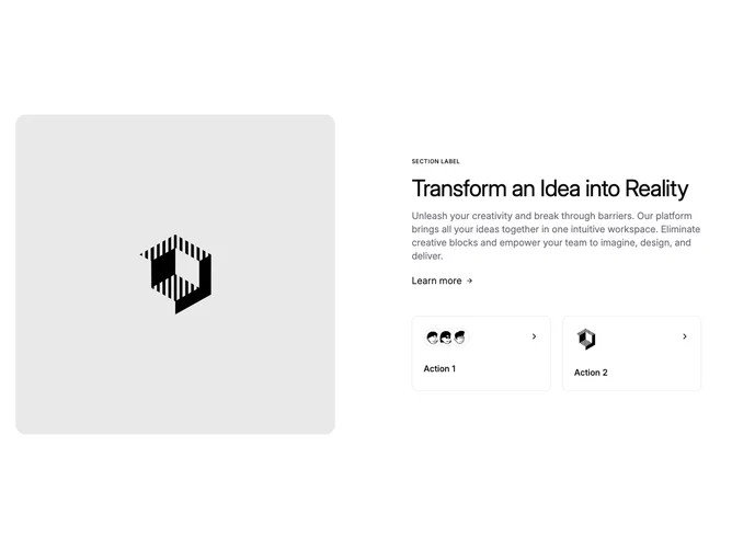
Feature80 is a split feature section built with shadcn/ui avatars and typography scales. On medium and larger widths, a square rounded image with accent shell sits beside a column that opens with an uppercase section label, oversized headline, and muted description. A Learn more text link with translating arrow precedes two side-by-side tiles: the first groups overlapping circular avatars with a title and trailing chevron, while the second swaps a single small illustration into the leading slot.
Color stays calm: accent wash behind the photo, borders on the secondary tiles, and minimal motion limited to icon translation. Density leans spacious, especially in the text column where line lengths stay comfortable thanks to partial-width layout.
Complexity is moderate because it blends hero imagery with social-style cues in the avatar stack and a second promotional surface. You will want a strong square photo, short labels for each tile, and real faces or marks if you keep the overlapping treatment.
On small screens the flex direction stacks, placing the image above the narrative so the story reads top-down. Tiles still form a column-friendly pair beneath the primary copy.