Feature 75 block design & features
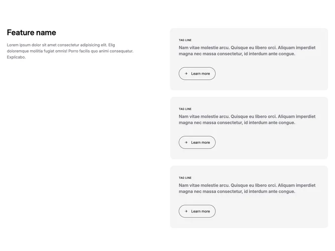
Feature75 is a split feature section built with shadcn/ui layout conventions. On medium screens and up, the left column holds a page-level heading and supporting copy while the right column stacks three entire clickable tiles laid on accent background. Each tile leads with a small uppercase label, a longer descriptive paragraph in emphasized muted tone, and a rounded Learn more capsule that picks up primary fill on hover with a sliding arrow.
The visual tone is soft but structured: rounded tile corners, generous vertical rhythm between tiles, and pill CTAs that feel tactile rather than flat text links. There are no photos here, so color blocks and typography carry the design.
This is a moderate-complexity pattern: content-heavy on the right and explanatory on the left, good when you want three parallel offers without a carousel. Uniqueness comes from making each row a full hit target rather than small buttons only.
On small screens the grid collapses to a single column, so the introduction reads first and the tiles follow in order. Tile hover states remain the primary motion cue.