Feature 217 A block design & features
Feature217a keeps the same accessibility talking points as its split variant but compresses the opening story into a centered column on a full-bleed photo band using shadcn/ui layout spacing for an illustrative framed image tucked directly under the introductory copy. Beneath that band, identical tri-column summaries appear with muted icons anchored above headings and subdued paragraph text constrained to readable widths.
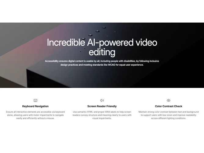
The hero keeps white type over a softened photograph with vignette layering so the midpoint focus stays textual and the embedded image reads like demo hardware. Outside the tinted stage the aesthetic returns to textbook marketing minimalism.
It is intentionally parallel to sibling blocks, trading side-by-side hero drama for symmetrical staging. Complexity is duplicated content planning rather than ornate layout scripting.
Responsive behavior centers every element vertically first, then fans the lower grid into thirds once horizontal space frees the columns without crowding line length.