Feature 25 block design & features
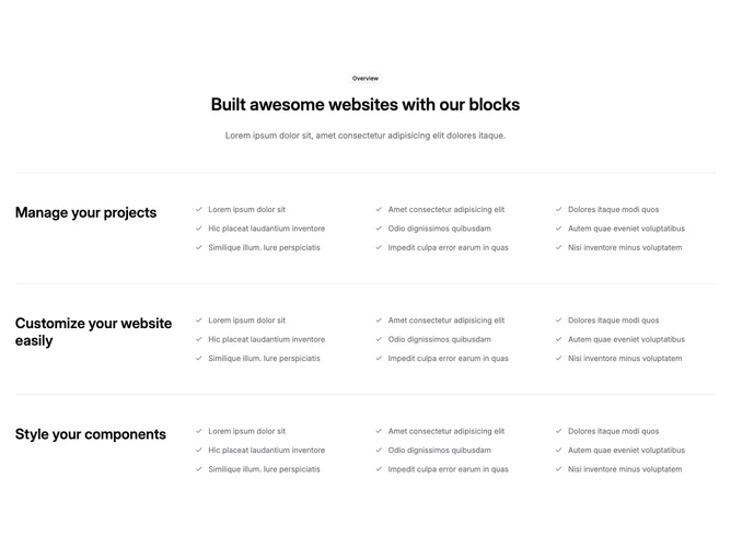
Feature25 is a dense product-capabilities page slice built with Shadcn UI badges and separators. An outlined badge introduces the block, followed by a page-width heading. Three thematic bands, each with its own title and short explanation, break the page into parallel capability areas such as project management, customization, and styling.
Within each band, items flow in a multi-column grid where every row begins with a check icon and a compact line of text, making long lists scannable. Separators between bands add clear rests so the section does not read as one uninterrupted wall.
This is a high-content, moderate-layout block: structurally simple grids and rules, but it expects many real bullets across categories. Empty bands will look unfinished; consider trimming to fewer columns if you do not have enough items.
On smaller breakpoints the four-column grid steps down to fewer columns so line lengths stay practical without horizontal scrolling.