Feature 256 block design & features
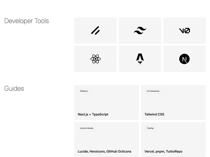
Feature256 is a documentation-style feature page segment built with shadcn/ui that splits into a tools grid and a guides section. The tools area shows vendor or product logos inside spotlight cards that react on hover; the guides area follows with headline-led rows or a short grid of articles.
Neutral surfaces with a mild focus effect on tool tiles: brightness or a soft radial highlight tracks the cursor while guide entries stay flatter with clear type hierarchy. Spacing separates the two bands so users understand they have crossed from “what we integrate” to “how to learn it.”
Moderate complexity: you need real logos with permission, short tool names, and at least a handful of guide titles that feel purposeful. The spotlight cards add polish compared with plain squares, but the section still depends on honest content rather than ornament.
Guides may reflow from two columns to one sooner than the tools grid; check line length for long titles on tablets.