Feature 220 A block design & features
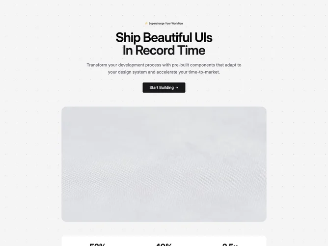
Feature220a is a stacked marketing section built with shadcn/ui: a centered text block, a wide autoplaying video, then a stat band. The top area uses a secondary badge, a two-line headline with the second line in primary color, paragraph copy, and a large button with a trailing arrow icon. The video sits in a rounded container with a fixed aspect ratio. Below, three metrics appear in a single row inside a card panel.
Muted page background with a repeating dot pattern. Primary color appears on headline emphasis, stat numbers, and the main button. Generous vertical padding and a bounded content width keep the section readable. The video and stat card use rounded corners; stats use bold numerals with short labels in muted text. The layout is static aside from the looping video.
This reads as a polished product marketing pattern with a clear focal stack instead of a side-by-side split. The dotted field and stat card add enough structure without extra chrome. Complexity is moderate: you need headline copy, a short paragraph, CTA label, three stat pairs, and a video asset.
On small screens the stat row stacks into a single column while the hero copy stays centered. The video remains full width within the container.