Feature 24 block design & features
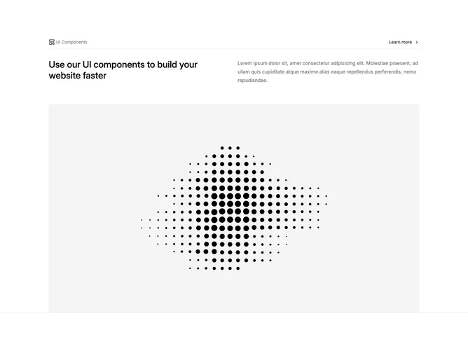
Feature24 opens with shadcn/ui layout utilities framing a slim header lane: muted label with accent layout icon beside text and an inline Learn more anchor with trailing chevron. A horizontal divider separates that row from headline and descriptive body sharing a split row at medium breakpoints, each column carrying half width, followed by a full-width rectangular image with lightly rounded upper corners cropping a wide photographic placeholder.
Restrained monochrome palette leaning on muted foreground for meta text and heavier weight on the headline. Border bottom on the enclosing section reinforces separation from following page content without heavy cards or shadows. The layout feels documentation-like rather than flashy.
Straightforward explanatory feature suitable for changelog or toolkit intros. Complexity is intentionally low: anchored header row, duplex text, singular media. Substitute earnest copy instead of filler Latin to maximize usefulness.
On narrow widths the headline stacks above the paragraph before the banner image, which keeps vertical rhythm predictable.