

Feature 189 block design & features
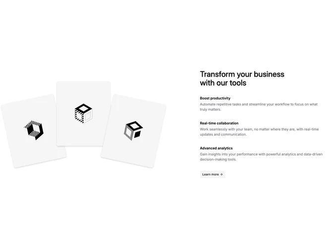
This layout is built with shadcn/ui Button and a plain grid. On large screens the left column is a relative stage where three rounded images sit at different z-index, rotation, and horizontal position so the group reads as a fan or stack. The right column limits width, carries a dark primary heading, then a vertical list of three feature items each with a bold label and muted explanatory paragraph.
The CTA sits under the list as a secondary-styled button with a small trailing arrow icon. Imagery is placeholder-friendly; shadows on each photo help them separate from the page background.
The look is friendly and slightly playful because of the rotated frames, but typography stays neutral and product-like. Complexity is moderate: the visual interest comes from image assets and positioning rather than animation.
On small screens the collage compresses above or beside the text depending on breakpoint spacing, while the feature stack and button remain easy to scan in one column.