Feature 74 block design & features
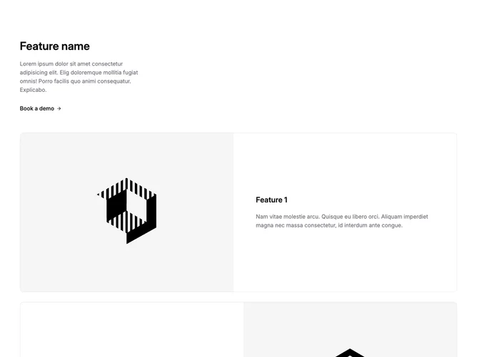
Feature74 is a feature section built with Shadcn UI primitives, opening with a narrow intro column: headline, muted paragraph, and a Book a demo link where the arrow nudges forward on hover. The lower region is a vertical stack of two large feature panels; from the medium breakpoint each panel becomes a two-column split with a tall image on one side and centered copy on the other, alternating which side carries the image between the first and second row.
Visually the section stays restrained: bordered rounded containers, photography or illustration filling the image area, and typography that leans on size and weight rather than ornament. The demo link mirrors the motion language of other blocks with a small translate on the icon. Density is medium, with generous padding inside each panel.
The aesthetic reads as modern marketing with a slight editorial feel from the alternating image placement. Complexity is moderate: you need two strong visuals and two clear feature stories rather than a long bullet list.
Panels stack in a single column on the smallest screens, keeping one feature story after another. The alternating second row reverses column order so the layout does not feel repetitive when both panels are visible side by side.