Feature 77 block design & features
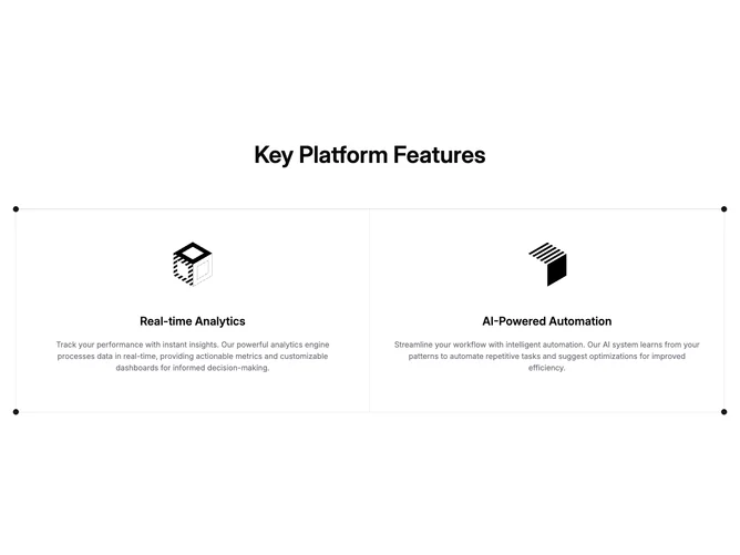
Feature77 is a compact showcase built with shadcn/ui spacing and border tokens. A centered headline introduces the block, then a bordered grid presents exactly two clickable columns at desktop width. Each cell is vertically stacked and centered: an illustration in a square frame, a mid-scale title, and supporting text in muted color. The whole grid sits inside a frame accented by small circular markers pinned just past each corner.
The styling is light-on-light with hairline borders separating the columns and a top rule that completes the boxy frame. Illustrations use object-contain so SVG artwork stays sharp. Hover and focus rely on default link treatment plus subtle duration on group transitions rather than large motion.
This is a simple, symmetric pattern suited to highlighting two flagship capabilities without tabs or imagery swaps. The corner dots are the main decorative flourish; otherwise the block follows standard marketing symmetry.
On mobile the cells stack with full-width dividers, preserving reading order from the first feature to the second. The centered hero line remains full width above the grid.