Feature 150 block design & features
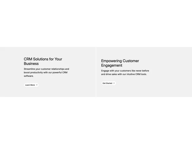
Feature150 is a two-column feature section built with shadcn/ui. A section wraps a responsive grid that becomes two equal-height panels on wide layouts and stacks to one column on smaller widths. Each panel is a single anchor that maps from data: a large heading, a supporting paragraph, a background image URL, and one of two button labels ("Learn More" or "Get Started"). Text and actions sit in a constrained column while an absolutely positioned image fills the panel behind the copy.
At rest the panels use a light tinted surface with black headline and body text plus an outline Button rounded into a pill and paired with an ArrowUpRight icon. Hovering fades the photograph from invisible to full opacity over a smooth transition while typography flips to white and the button shifts toward a transparent treatment so it reads on top of the photo. Images use object-cover so they crop evenly across the card.
Overall the block reads bold and magazine-like: photography stays hidden until interaction, so the layout emphasizes typographic panels first. It is structurally straightforward (two repeated cells from one array) but gains personality from the full-card reveal and the slight asymmetry in how each panel aligns its inner column on wide layouts. Expect to swap in real CRM or product photography and rewrite the two titles, descriptions, and button labels for your product story.
On narrow screens the panels stack with a generous minimum height per row so each block still feels like a substantial tile. Hover-dependent visuals behave like desktop hover states; touch users see the default tinted panels unless their platform synthesizes hover.