
Feature 173 block design & features
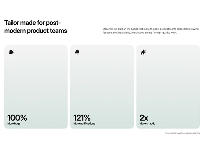
Feature173 is a split intro plus metrics grid built with Shadcn UI-friendly spacing. On wide screens the top row places a prominent left headline beside a muted right paragraph pulled to the baseline. Below sits a responsive grid that resolves to three equal columns when space allows; each tile is dominated by an outline icon chip, giant numeric headline, and short subtitle that reads like a spoof KPI trio. The block ends with a small right-aligned explanatory footnote beneath the grid.
Muted foundation colors carry into cards through a shallow top-to-bottom gradient that feels softly lit rather than glossy. Panels use deep rounded shells, generous internal padding, and icon fills that punch slightly warmer than the body text. Everything stays static; motion is implied only through color contrast and scale of the numbers.
The tone is playful product marketing: big type and punchy fake metrics give it more personality than a sober dashboard row, while still looking like a serious component library block. It is moderately complex because it coordinates headline rhythm, three independent cards, and an optional disclaimer line. Expect to swap values, labels, footnote copy, and icon choices to match your brand voice.
On small screens the header stacks and the metrics flow in a single column or two-up pattern before the full three-wide layout returns, so the reading order stays headline, body, then evidence cards.