
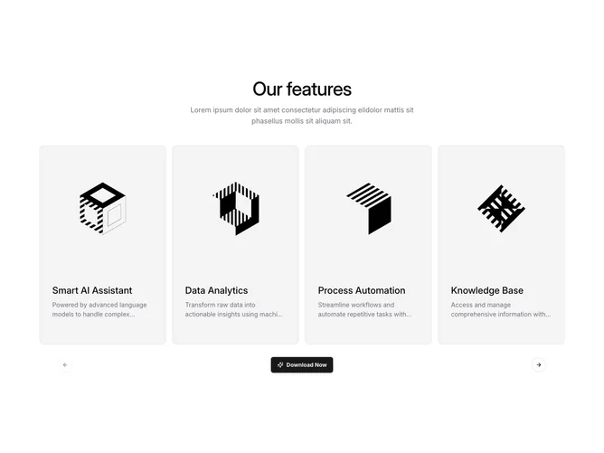
Gallery 12 block design & features
A center-aligned heading and muted-foreground paragraph introduce the section, followed by a Shadcn UI Carousel that displays feature cards across responsive breakpoints. Each card sits inside a rounded-xl bordered container with a muted background, stacking a 3:4 cover image on top and a text block with a title and description below. Navigation arrows and a centered call-to-action Button with a sparkle icon appear beneath the carousel.
The cards use a subtle border and muted fill to separate them from the page surface. Typography pairs a medium-weight title at larger sizes with smaller muted-foreground body text, both line-clamped for consistency. The round outline arrow buttons at the footer edges mirror each other with matching disabled states.
The presentation is restrained and informational, leaning on even spacing, uniform card heights, and simple surface treatment rather than strong color or motion. The result is a catalog-style layout that keeps the images as the focal point.
Across breakpoints the carousel shifts from a single visible card on small screens to two, three, or four columns on wider viewports, with drag-free scrolling enabled only on mobile.