
Navbar 7 block design & features
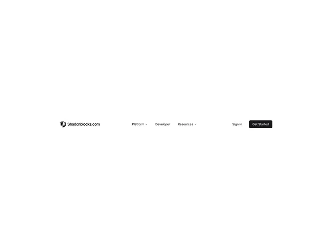
Navbar7 is a full-width header built with shadcn/ui, with logo and title on the left, Platform and Resources mega menus, a standalone Developer text button, and Sign in plus Get Started on the right. Platform splits into Solutions with four icon cards carrying descriptions and By Use Case with eight compact industry links. Resources shows twelve AI-themed entries in a three-column grid, each with icon tile, title, and blurb. Mobile collapses into a fixed overlay with dashed dividers, accordion sections mirroring desktop groups, a Developer row, login prompt text, and a large Start now button.
Muted icon tiles with light shadows sit beside link copy. Section labels use spaced uppercase styling. The mobile menu uses dashed horizontal rules instead of solid borders for a lighter technical feel. Hover brightens icons inside tiles.
Moderate to high complexity focused on icon density and categorized lists rather than photography. Fits AI, cloud, or developer platform brands. Content-driven: many labeled icons and short descriptions need replacement for production.
The mobile panel fills the viewport below the header height and scrolls internally. Desktop mega panels are wide but shorter than full-bleed enterprise menus.