






Shadcn Gallery Blocks

Browse 52+ Shadcn UI Gallery blocks, sections & components built with React, Tailwind CSS and shadcn/ui. Copy & paste the code or install via the shadcn CLI.

Shadcn Gallery 27 - Team member carousel

Team member carousel

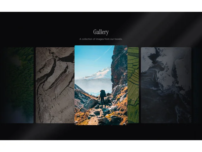
Shadcn Gallery 21 - Coverflow image slider with gradient masks

Coverflow image slider with gradient masks

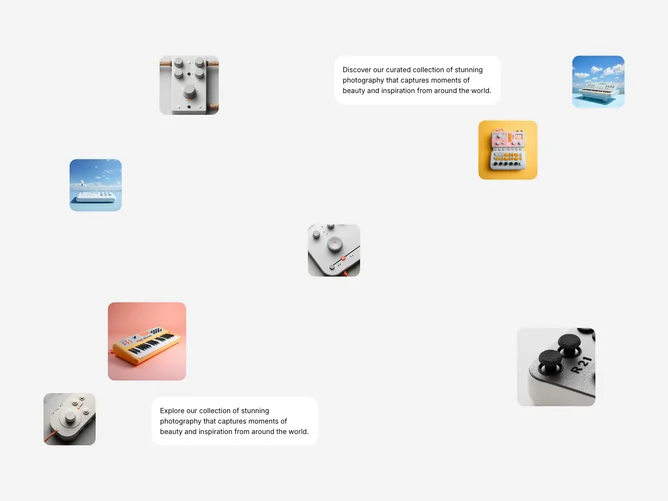
Shadcn Gallery 30 - Draggable scattered photo collage

Draggable scattered photo collage

Shadcn Gallery 32 - Overlapping photo collage with focus blur

Overlapping photo collage with focus blur

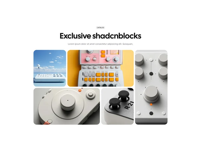
Shadcn Gallery 31 - Image bento with direction-aware hover

Image bento with direction-aware hover

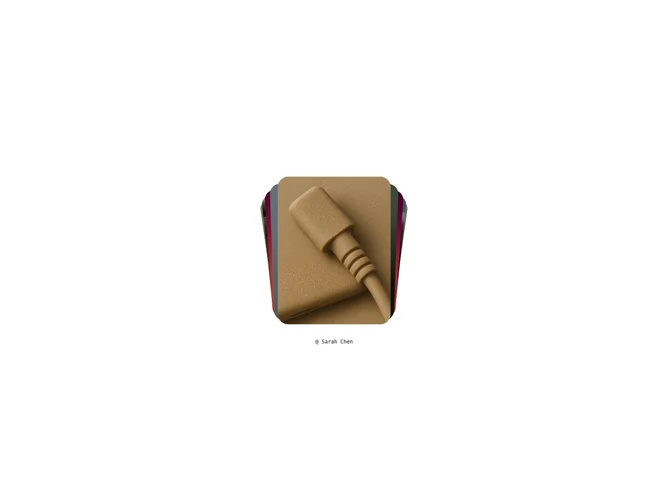
Shadcn Gallery 18 - Image stack with name caption

Image stack with name caption

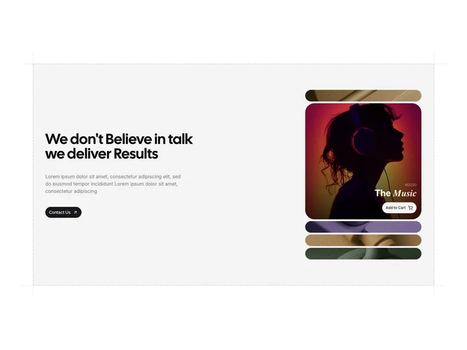
Shadcn Gallery 19 - Image stack with overlay details

Image stack with overlay details

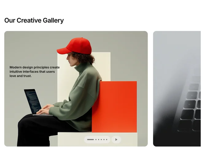
Shadcn Gallery 7 - Auto-scrolling image carousel with text intro

Auto-scrolling image carousel with text intro

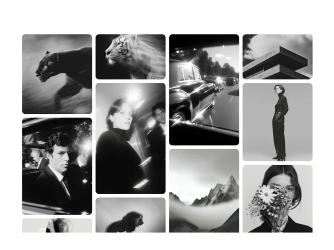
Shadcn Gallery 25 - Animated masonry photo grid

Animated masonry photo grid

Shadcn Gallery 6 - Gallery carousel with demo link

Gallery carousel with demo link

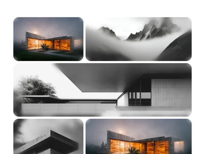
Shadcn Gallery 26 - Blur vignette image grid

Blur vignette image grid

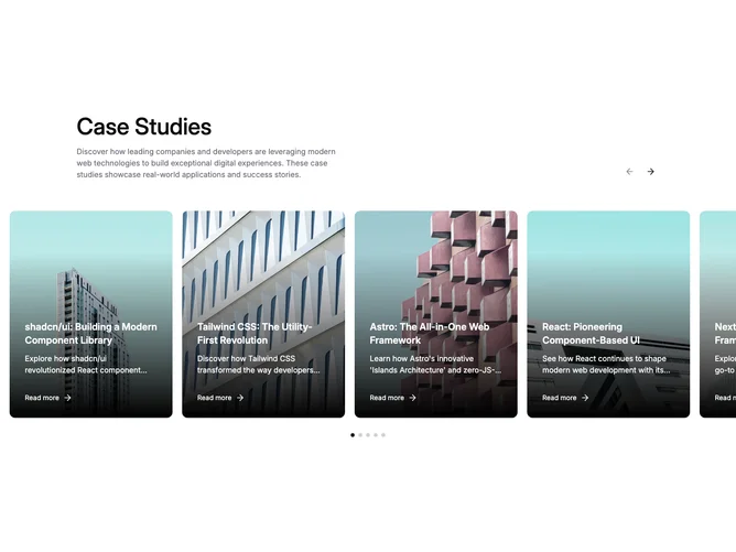
Shadcn Gallery 4 - Case study carousel with dot indicators

Case study carousel with dot indicators

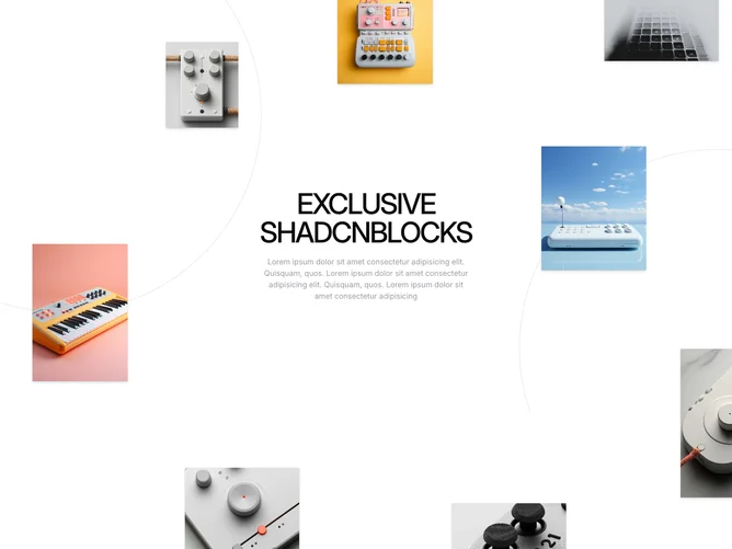
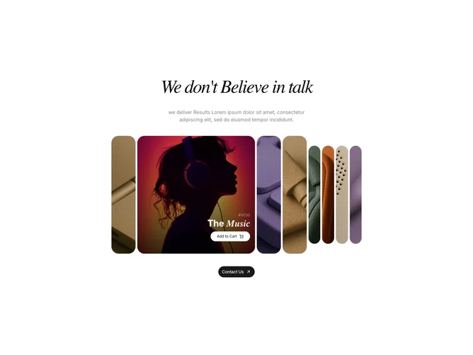
Shadcn Gallery 29 - Marquee gallery with featured overlay

Marquee gallery with featured overlay

Shadcn Gallery 9 - Step carousel with clickable section labels

Step carousel with clickable section labels

Shadcn Gallery 11 - Image card carousel with overlay labels

Image card carousel with overlay labels

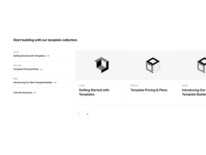
Shadcn Gallery 8 - Resource list with image carousel sidebar

Resource list with image carousel sidebar

Shadcn Gallery 13 - Split carousel with detail panel

Split carousel with detail panel

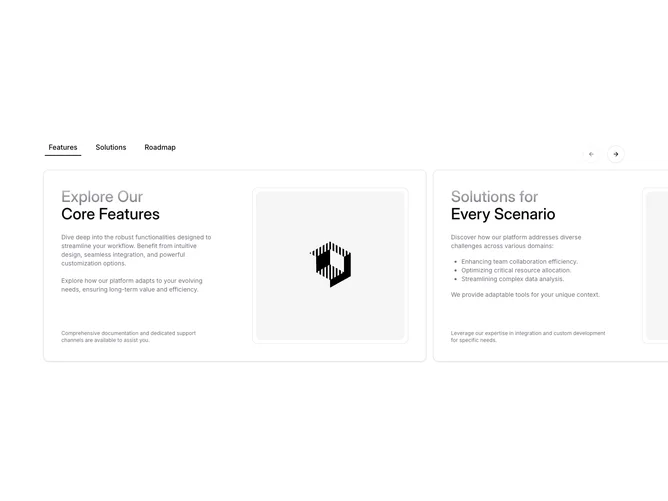
Shadcn Gallery 16 - Tab-synced content carousel

Tab-synced content carousel

Shadcn Gallery 17 - Centered image carousel with scale effect

Centered image carousel with scale effect

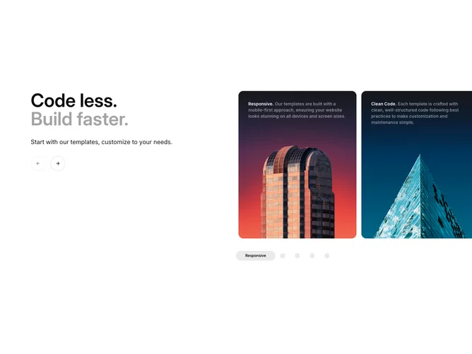
Shadcn Gallery 5 - Feature carousel with icon toggle group

Feature carousel with icon toggle group

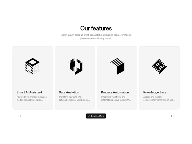
Shadcn Gallery 12 - Feature cards carousel with centered heading

Feature cards carousel with centered heading

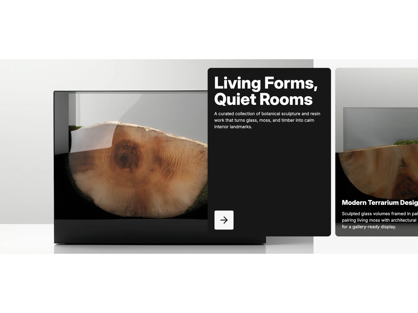
Shadcn Gallery 1 - Expanding case study cards

Expanding case study cards

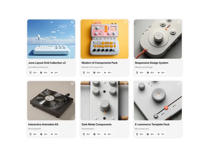
Shadcn Gallery 34 - Gallery grid with hover blur and stat chips

Gallery grid with hover blur and stat chips

Shadcn Gallery 20 - Scattered draggable photo stack

Scattered draggable photo stack

Shadcn Gallery 28 - Centered image carousel with overlay controls

Centered image carousel with overlay controls

Shadcn Gallery 15 - Product carousel with hover image swap

Product carousel with hover image swap

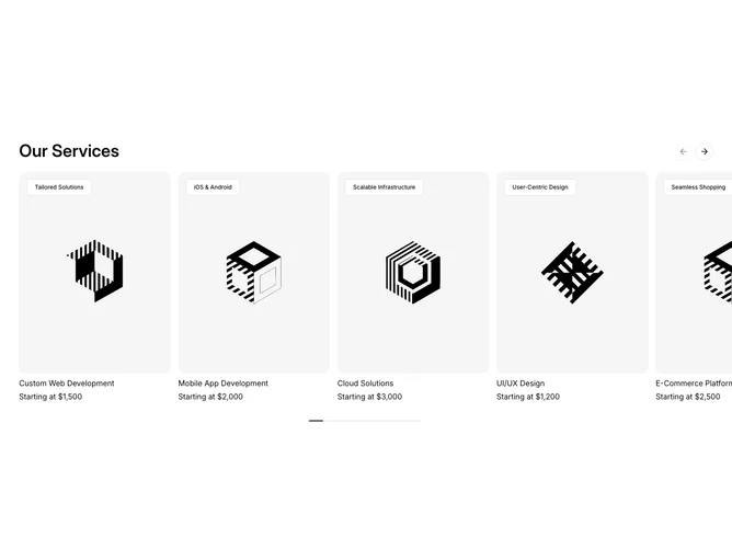
Shadcn Gallery 3 - Case study card carousel

Case study card carousel

Shadcn Gallery 24 - Horizontal accordion gallery with header

Horizontal accordion gallery with header

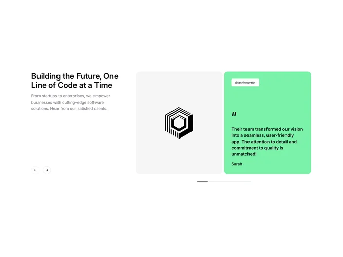
Shadcn Gallery 10 - Testimonial carousel with side text

Testimonial carousel with side text

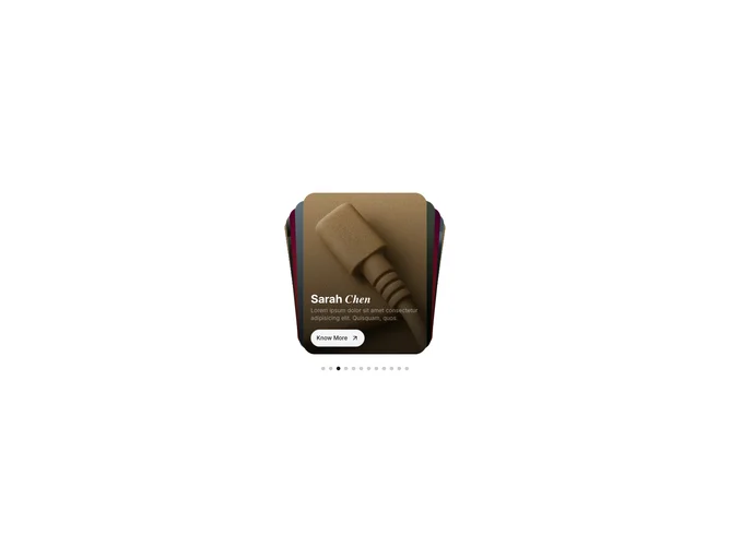
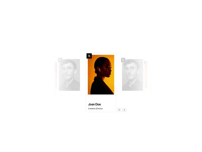
Shadcn Gallery 22 - Coverflow team carousel with info card

Coverflow team carousel with info card

Shadcn Gallery 14 - Carousel with expanding dot navigation

Carousel with expanding dot navigation

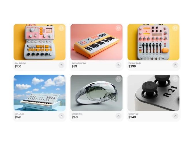
Shadcn Gallery 33 - Product card grid with lens zoom

Product card grid with lens zoom

Shadcn Gallery 23 - Accordion image stack with text panel

Accordion image stack with text panel

Shadcn Gallery 39 - Reveal gallery carousel over hero

Reveal gallery carousel over hero

Shadcn Gallery 40 - Three column image grid

Three column image grid

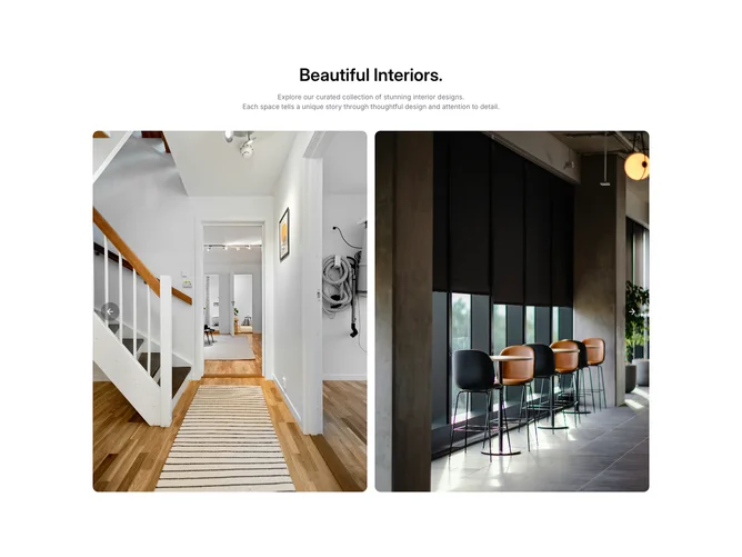
Shadcn Gallery 41 - Captioned two column gallery

Captioned two column gallery

Shadcn Gallery 42 - Masonry column mosaic

Masonry column mosaic

Shadcn Gallery 43 - Lightbox image grid

Lightbox image grid

Shadcn Gallery 44 - Single slide gallery carousel

Single slide gallery carousel

Shadcn Gallery 45 - Asymmetric bento image grid

Asymmetric bento image grid

Shadcn Gallery 46 - Filterable category gallery

Filterable category gallery

Shadcn Gallery 47 - Hero preview with thumbnail strip

Hero preview with thumbnail strip

Shadcn Gallery 48 - Inverted dark framed gallery

Inverted dark framed gallery

Shadcn Gallery 49 - Polaroid collage grid

Polaroid collage grid

Shadcn Gallery 50 - Before after compare sliders

Before after compare sliders

Shadcn Gallery 51 - Horizontal snap photo strip

Horizontal snap photo strip

Shadcn Gallery 52 - Caption hover bento grid

Caption hover bento grid

Shadcn Gallery 53 - Featured image with side thumbs

Featured image with side thumbs

Shadcn Gallery 54 - Filterable masonry photo columns

Filterable masonry photo columns

Shadcn Gallery 55 - Hover reveal project grid

Hover reveal project grid

Shadcn Gallery 56 - Social style photo grid

Social style photo grid

Gallery blocks are dedicated sections of a webpage focused on gallery content. They appear on landing pages, product pages, and marketing sites as key elements that communicate value and drive user engagement.

Each block is a self-contained React component which you can copy/paste the code or install via the shadcn CLI. You own the code and can modify however you like, or us AI and LLMS to quickly change the design.

Our gallery blocks combine headlines, supporting text, images, icons, CTA buttons, and responsive layouts. Each block is designed with clear visual hierarchy and consistent spacing to integrate seamlessly into any page structure.

Different goals call for different gallery sections. We’ve organized our gallery blocks into subgroups so you can find the right layout for your use case:

Frequently Asked Questions

How are Shadcnblocks gallery blocks built?
Shadcnblocks gallery blocks are built with React, Tailwind CSS, and shadcn/ui components.

What technologies are used to build Shadcnblocks gallery sections?
Shadcnblocks gallery sections are built with React, Tailwind CSS, and shadcn/ui components. They use standard React components and Tailwind utility classes for styling.

What frameworks do Shadcnblocks gallery components work with?
Shadcnblocks gallery components work with any React-based framework including Next.js, Remix, Astro, and Vite.

Can I customize Shadcnblocks gallery blocks?
Yes. Every block is source code you add directly to your project. You can modify the text, images, colors, layout, and behavior using standard React and Tailwind patterns.

Do Shadcnblocks gallery sections support dark mode?
Yes. All blocks use shadcn/ui’s theming system and support light and dark mode out of the box.

How do I install a Shadcnblocks gallery block?
The best way to install a Shadcnblocks gallery block is to use the shadcn CLI: npx shadcn add @shadcnblocks/{blockId}.

Can I copy and paste the code into my project?
Yes. Every block is ready to copy and paste the code directly into your project. Just click the “code” tab on any block to view the source code.