Shadcn UI Gallery Block
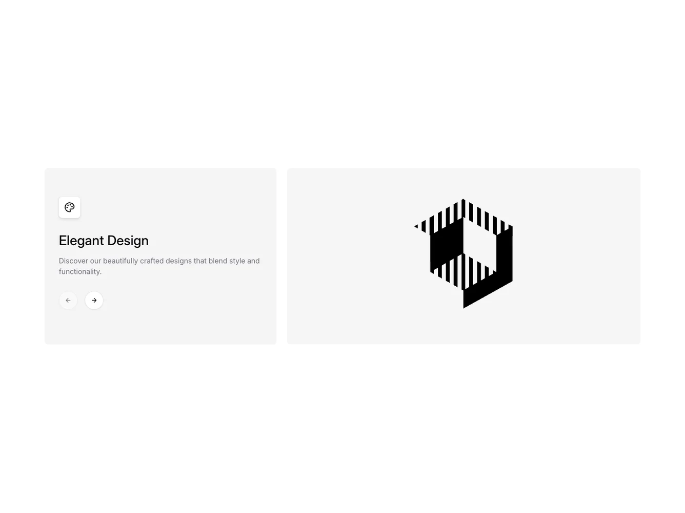
Gallery13 is a versatile shadcn ui component designed to create an engaging and interactive visual display for showcasing a collection of items. This component employs a carousel layout to allow smooth navigation through various content pieces, enhancing user experience by blending visual appeal with functional design elements.
At its core, Gallery13 integrates a responsive carousel that highlights different items, each accompanied by a title, description, and an icon to convey specific characteristics. Users can navigate through the items using intuitive controls, while the component dynamically updates the displayed content based on user interactions. The left-hand side of the layout prominently features current item details, including a unique icon, while the images occupy the right side in a flexible grid format. This shadcn component is ideal for emphasizing modern aesthetics in a concise and accessible manner.
Dependencies
| Package | Type |
|---|---|
| lucide-react | NPM |
| react | NPM |
carousel @shadcn | Registry |
