Gallery 33 block design & features
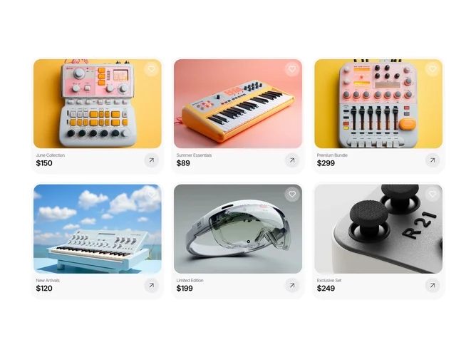
The Gallery33 component is a curated display of card elements, featuring enticing visual and thematic content. Designed with an engaging layout, each card showcases a distinct collection complete with a title, price, and image. The component seamlessly integrates smooth interactivity, providing users with visual feedback as they explore different collections. Each card also includes a directional arrow inviting further interaction and exploration of the collection.
Expanding further, the Gallery33 component sets itself apart as a shadcn ui-oriented block, emphasizing user engagement through the use of hover effects and cleverly incorporated icons. With a grid-based layout accommodating various screen sizes, Gallery33 presents visual content in a clean and organized manner. Additional features, such as the Lens component integration for hover state management and interactive icons for intuitive user actions, enhance the user experience by providing dynamic feedback and inviting further exploration. The design supports easy scalability and content customization to suit diverse presentation needs.