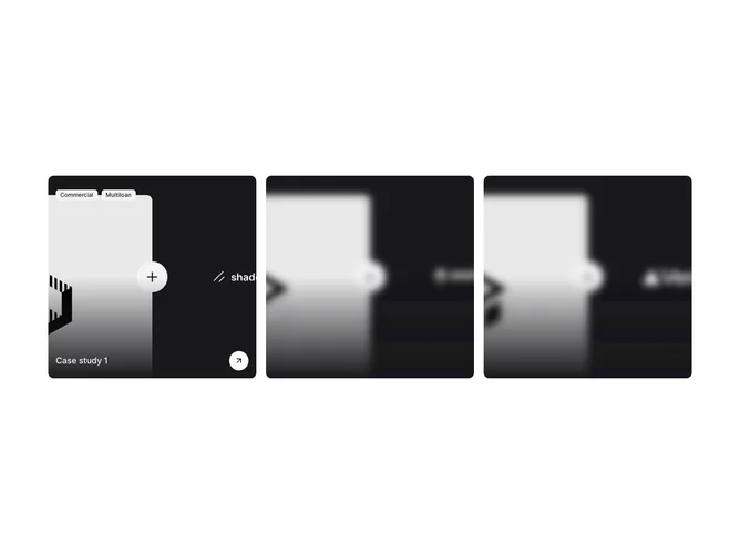
Gallery 1 block design & features
Gallery1 is an expanding case study row built with shadcn/ui. A small eyebrow and heading sit above four tall panels, each filled edge to edge with an architectural photograph under a dark gradient. The focused panel widens to take most of the row and reveals the client's wordmark, a pair of tags, the project title, a short summary, and a headline result with its label, plus a round arrow in the corner.
Panels resize smoothly on a long ease while the photo inside settles from a slight zoom, and the details fade and lift in just after the panel opens. Collapsed panels show only the client name set vertically along their base. Hovering, tabbing to, or tapping a panel brings it forward, and the whole panel is a link.
It is a polished, premium take on the accordion gallery that suits agencies, studios, and consultancies presenting a handful of flagship projects. It needs a wide photo, logo, title, summary, tags, and one result per case study.
On smaller screens the panels stack as full cards with all of their details visible.