Gallery 14 block design & features
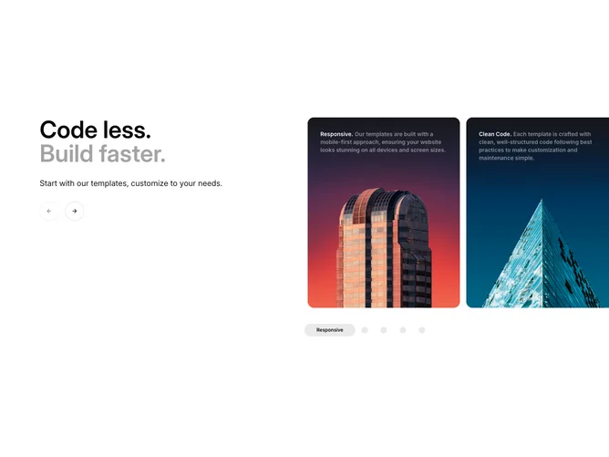
Gallery14 is a classic viewer with a thumbnail strip. In this shadcn/ui block, a heading and counter sit above a wide 16:9 frame with a title pill in its corner, and a horizontal strip of thumbnails runs underneath.
The left and right thirds of the frame act as previous and next zones with matching cursors, and the arrow keys work when the frame has focus. Photos crossfade as they change. The active thumbnail gets a ring and full opacity while the rest are dimmed, and the strip scrolls smoothly to keep the active thumbnail in the middle.
It is a dependable, familiar pattern for longer sets, such as a project's full photo series or a property listing. It needs wide images with a short title each.