
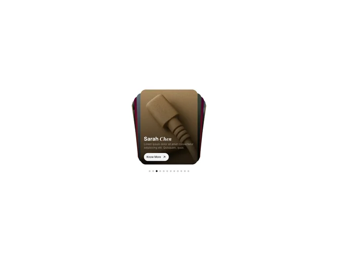

Gallery 19 block design & features
Gallery19 is an editorial card deck built with shadcn/ui. A large stack of portrait cards sits in the center of the section with the next few cards fanned behind the front one. The front card carries a dark gradient with a two-tone title, set partly in an italic serif, a one-line description, and a small rounded button. Stretching dot pagination sits under the deck.
The deck advances on its own on a spring, sending the front card off to the left while the next one rises into place, and the overlay copy fades and lifts in just after each card arrives. Cards can be swiped or dragged in either direction, the arrow keys work while the deck has focus, and hovering pauses autoplay.
It feels premium and magazine-like, suited to stories, campaigns, and featured collections. It needs portrait images with a title, accent word, description, and link for each story.