Gallery 28 block design & features
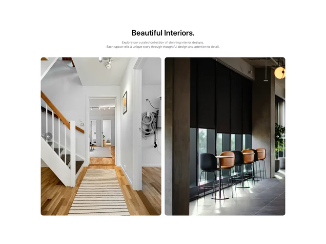
The section starts with a centered heading and a two-line description in muted foreground text, followed by a shadcn/ui Carousel constrained to a max width. Each slide occupies half the carousel width and displays a tall portrait-ratio image with rounded corners.
Navigation buttons sit directly over the images near the left and right edges, styled with a semi-transparent black background and white icons. The dark overlay treatment keeps the controls visible regardless of image content, and the hover state deepens the background opacity. The carousel loops continuously and handles backface-visibility to prevent rendering flicker during transitions.
The overall look is gallery-minimal, letting the photographs dominate while the chrome stays quiet. The centered intro text and simple controls give it a clean, editorial quality without additional metadata or interactive embellishments.