Gallery 3 block design & features
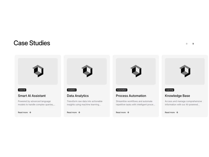
The Gallery3 component is an interactive image-based carousel designed to showcase a variety of items, such as case studies or product features. Built with several features integrated under the shadcn component library, this carousel offers navigation through items using next and previous buttons, enhancing user interactivity. By managing the visibility of these navigation buttons based on the user's position in the carousel, Gallery3 delivers a seamless and intuitive experience.
In greater detail, the Gallery3 component leverages shadcn blocks to present data in a visually appealing and easily navigable way. It consists of Carousel, CarouselContent, and CarouselItem elements to structure the content. This ensures each item, which includes a description, an image, and a clickable link, is displayed prominently. The component reacts to screen size changes by adjusting its dragging functionality, allowing users to swipe through items on smaller screens. The integration of features such as clickable badges and hover animations enriches the user experience, making the component not just functional but visually engaging.