Gallery 30 block design & features
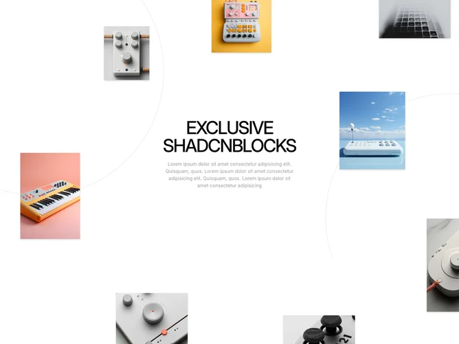
Gallery30 is a shadcn component designed to display an engaging, dynamic image gallery on your webpage. By incorporating motion elements from framer-motion, the component creates an animated backdrop of images that can be shuffled and moved around, allowing for an interactive user experience. This component stands out by shuffling its array of pre-defined images upon each render. The images are initially hidden, then smoothly animate into view, offering a visually appealing introduction that captures user interest effectively.
In more detail, the Gallery30 shadcn ui features an array of images strategically positioned for optimal visual impact. This shadcn block provides an interactive drag-and-drop functionality to its images, allowing users to rearrange and explore the visual content dynamically. The component uses motion effects with variable delays, adding depth and dimension to the presentation. A simple structured layout displays images in a layered fashion, enhanced by an eye-catching SVG illustration background, which completes the component with a modern touch. Adding to its appeal, the content includes a concise heading and description segment, elegantly introducing the exclusive shadcnblocks offering to viewers.