Gallery 8 block design & features
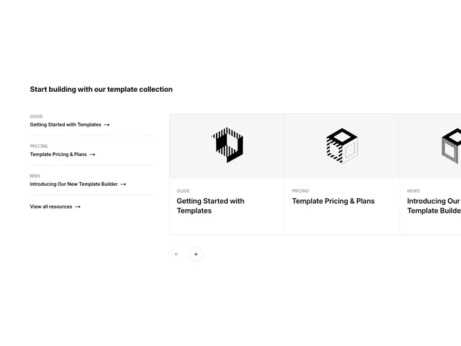
The Gallery8 component is designed to showcase a collection of template resources in an organized and visually appealing manner. It features a carousel display that allows users to browse through different resources, each represented by an engaging image and a title. The component is built to accommodate multiple resources, making it an ideal solution for presenting extensive collections effectively.
In detail, the Gallery8 component integrates a multi-column layout where a prominently featured carousel occupies the majority of the display area. Resources are displayed with large, striking images alongside concise, informative descriptions. The component includes navigation controls to move through the carousel and a sectioned layout to delineate different categories of information. This setup not only enhances the user interaction but also leverages the shadcn ui style to maintain a coherent visual language, ensuring that each element of the shadcn block stays consistent and intuitive for users.