Gallery 9 block design & features
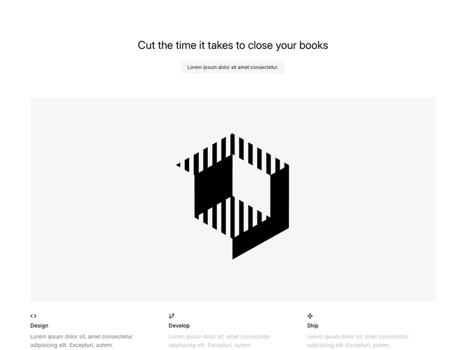
Gallery9 is an interactive carousel component designed to showcase different stages or sections with visually appealing transitions. It organizes content into a series of slides, each representing a specific section, like "Design," "Develop," and "Ship." These slides are navigable through intuitive controls, allowing users to view each segment individually in a seamless and engaging manner.
A hallmark of the Gallery9 component is its flexibility in showcasing visual content across multiple sections. Each carousel item is accompanied by a descriptive icon and text, encapsulating key information in a compact and accessible format. The component also integrates a dynamic indicator that shows the user's current position within the gallery, enhancing the user experience by providing context and progress visibility.